Lumion BLOG
Feel the space with Lumion
Dreamy effects for design concepts
TweetShareShareSharePhotorealism can often seem like the rendering holy grail. But sometimes there are better ways to get your clients engaged in your design. So how can the effects available in Lumion help create the right discussion with your clients?
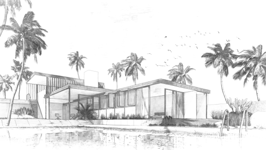
At the early stages of design, you might want to show your client the direction your design is heading towards while not getting into too much detail. General issues of form and function are good subjects but issues like material specifications are probably off-topic at this point. At this stage, it’s often good to be more impressionistic than realistic.

Above: Sketch effect
So what are the options in Lumion? The truth is that there are a really a lot, especially when you consider combinations. Nevertherless we’ve featured a few to help you to get started.
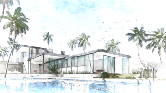
A simple black and white sketch effect is a great way to show a basic design idea without getting bogged down in details. The sketch renders above and below, both made using the sketch effect in Lumion, have different slider settings. A bit of color in your sketched concepts can help create a specific feel and adds some life to the image.

Above: Sketch effect with some color added
The image below uses a small amount of the oil paint effect, which blurs some of the edges and surfaces. Other sketch and paint effects can be used for similarly appealing results.

Many more possibilities for getting great-looking results through adding effects exist in Lumion. You can check out some previous blogs covering some of the aspects in the following links:
- Polished renders and effects
- Using effects and lighting for interiors
- Step-by-step guide to making a great render

Above: ‘Analog color lab’, ‘god rays’ and ‘volume cloud’ used to get a dusky dreamy quality
Find out how to use more effects on the Lumion Tutorial page. Give a try and see what unique styles you can come up with using combinations of different effects!
#Lumion